œvra
Designing for creative flow
oevra is the first app designed to enhance your creativity and help you get into the flow state, based on neuroscience and psychology. This digital platform is our first applied product — made to support creative flow in a world where attention, work, and meaning are being reconfigured.
View our case study and interview in The Brand Identity.
Creative director, writer, strategist, product creator: Tasha Young
Front-end website design / development: Overpx — Federico Pian and Agostina Ciccone
App development: Cameron Little
Logo design: Cayleth Vivas
Most people struggle with creative blocks, focus, flow state, motivation, inspiration — but there was nothing out there to help with that since books like The Artist's Way. As a professional creative, I became interested in solving this problem, starting with deep research into how creativity actually works — cognitively, physiologically, experientially.
The more I learned, researched, and talked with my potential users (both aspiring and professional creative people), the clearer the problem became. We treat creativity as a gift rather than a skill, which means most people either take it for granted or give up on it. The cognitive science says otherwise: creativity, like memory, is trainable. It strengthens with practice and degrades without it.
oevra was built on that premise, and on the belief that the tool itself needed to embody the principles it teaches.
Product, experience, and content design
Before any design decisions were made, the foundation was research: into neuroscience, psychology, mindfulness, and the phenomenology of creative work. Key findings shaped every subsequent decision:
The brain enters creative states differently than productive states. Flow requires the right conditions — low anxiety, intrinsic motivation, appropriate challenge level — not willpower. This meant designing an environment that reduces friction and psychological pressure rather than adding gamification and achievement pressure.
Creativity and mental health are deeply linked. The cognitive and emotional benefits of creative practice are comparable to meditation or exercise. This repositioned oevra not just as a productivity tool but as a wellbeing practice — a reframe that shaped tone, language, and feature hierarchy.
A user survey confirmed the platform decision: the majority of respondents said they were more likely to use oevra on desktop, while actively working on a creative project or seeking focus. A mobile app alone would have put it in the wrong context — five-minute breaks between notifications, not sustained deep work sessions. Web app came first, and mobile (iOS) is currently under development.
Brand & Product in Parallel
The most distinctive structural decision in building oevra was developing brand and product simultaneously rather than sequentially. This wasn't a strategy — it was a necessity that turned out to be an advantage.
Because the product's purpose was to support a mental and creative state, the interface itself had to embody that state. The brand principles weren't a wrapper applied at the end; they were functional requirements from the start. Clarity, restraint, and atmospheric continuity weren't aesthetic preferences — they were UX principles.
The governing question for every design decision, visual or interactive, became: does this support flow, or interrupt it?
Visual Identity
The logo grew from a single typographic character: the œ ligature in the French word œuvre. The near-symmetry of the form — where curvature meets linear structure — became a conceptual anchor. The 'o' was developed under the influence of Isamu Noguchi's stone sculptures: something that in 2D appears balanced, and in 3D would hold light and shadow. The 'e' resolves as a full circle intersected by a single straight line, introducing contrast and restraint. Working with Chilean designer Cayleth Vivas, the mark was developed as a quiet sculptural element rather than a graphic symbol.
Colour was built around a soft, desaturated green — chosen for its connection to spaciousness and ease of attention — extended into a system of atmospheric gradients that mirror the shifts in creative focus. The palette deliberately avoids saturation: high-contrast, vibrant interfaces stimulate; oevra needed to settle.
Typography pairs Galaxie Copernicus — intellectual, precise, with warmth — with Suisse for interface and functional text. The wordmark is a custom adaptation of Galaxie Copernicus, adjusted for balance and rhythm.
Photography was sourced by licensing work from artists already capturing the beauty of creative practice — including Georgia Hilmer's studio visit series — rather than staging shoots. The distinction mattered philosophically: in an era saturated with AI-generated and artificially staged content, the authenticity of real people doing real work in real spaces communicates values nonverbally in a way no art-directed photoshoot can replicate.
Interaction Design
The web experience was developed in collaboration with Overpx (Federico Pian and Agostina Ciccone) — chosen because Federico's portfolio had lived on my moodboard for years. His approach to motion, colour, and layout demonstrated a shared sensibility: that animation needs rhythm to bring small but meaningful moments of delight, and that transitions either support attention or fracture it.
Every animation in oevra is slow, deliberate, and functional. The interaction philosophy was built from a simple principle: subtle cues that reassure the user they're still moving forward, without pulling them out of their internal rhythm. Nothing asks to be watched. Everything stays with you quietly while you work.
Sound: Commissioned Ambient Music
Sound was not an afterthought or a licensed library. Ambient music is central to how oevra works — not as background content, but as an environmental condition for creative focus, grounded in research on how sound affects cognitive state and attention.
I commissioned original compositions from three artists working at the forefront of contemporary ambient music: Loris S. Sarid, Rhucle, and H. Takahashi. Each was given the brief and trusted to interpret it. The test for each piece was simple: I listened at my desk on hifi speakers, as if I were about to begin my own creative work. No notes were needed. All three delivered long-form sonic experiences designed for extended focus sessions — not tracks with three-minute loops, but compositions that develop over time and hold a room without dominating it.
The result is an in-app sound experience that is genuinely immersive in a way licensed library music cannot be: it was made for this specific purpose, by artists who understand atmosphere.
Product Features
The Creative Process
The foundational content experience: a guided journey through oevra's proprietary Routine → Jolt → Flow framework, derived from research into how the brain moves through stages of creative readiness.
Routine builds the neural pathways for creative thinking through consistent daily practice. Jolt introduces productive disruption — exposure to the unfamiliar that shakes loose habitual patterns. Flow is the condition where ideas emerge without friction.
Content is structured into self-paced courses and lessons, with a distinction between foundational Process content and more experiential Praxis content. The IA decision to make Process the entry point — before unlocking broader content — was research-backed: users who understand the framework get more from the exercises. Courses are structured as choose-your-own-adventure after the foundational sequence, allowing users with different needs and time constraints to navigate non-linearly.
The Flow State Timer
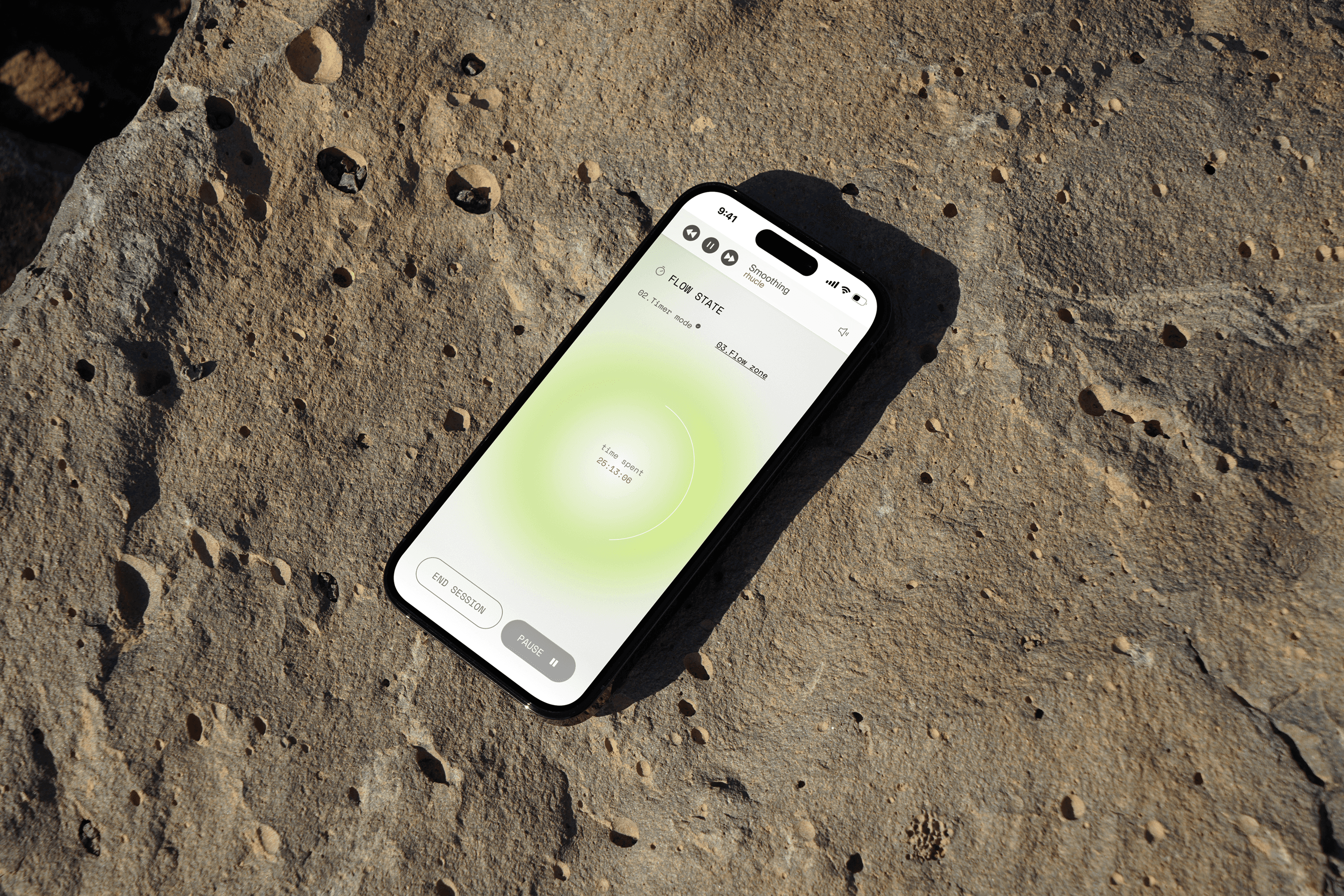
The timer is the centrepiece of the daily practice experience. It is built for a specific cognitive purpose: structured focus intervals reduce decision fatigue and signal to the brain that it is in a work mode, which research associates with faster entry into flow states.
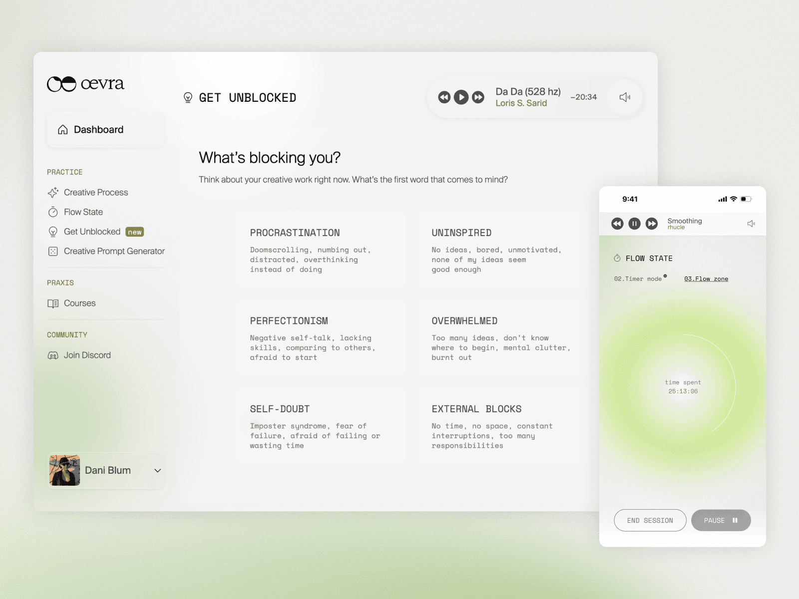
The key UX decision was continuity: the timer persists and follows the user as they navigate other parts of the app — accessing educational content, using the prompt generator, moving through the Get Unblocked flow. It does not reset or pause unless the user chooses to stop. The rationale was practical and philosophical: interrupting your timer to access a creativity prompt would defeat the purpose. The session should feel unbroken. Multiple timer modes accommodate different working styles and session lengths.
The timer integrates directly with the ambient music layer, creating a unified environmental condition rather than two separate features.
Get Unblocked
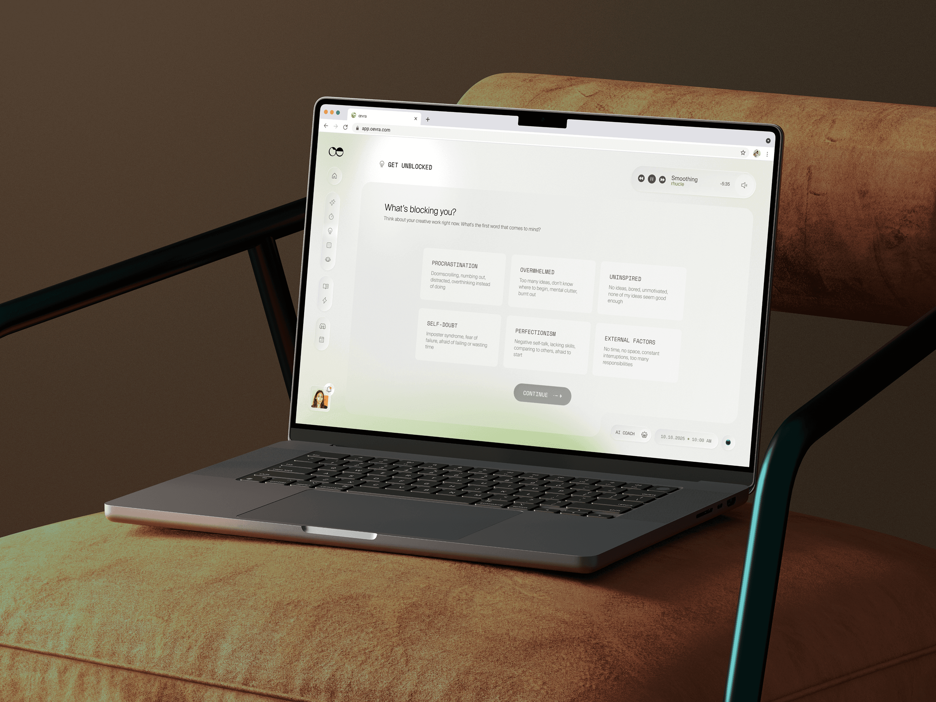
A dedicated flow for users experiencing resistance, blocks, or creative stagnation. Rather than offering generic encouragement, Get Unblocked moves through a structured sequence — rooted in divergent thinking research — designed to shift the user's cognitive state before returning them to their work. The IA positions this as a branch within a session, not a separate destination: you can access it mid-timer without losing your place.
Creative Prompt Generator
Inspired directly by Brian Eno and Peter Schmidt's Oblique Strategies — a card deck designed to interrupt habitual creative thinking — oevra's prompt generator draws randomly from a curated collection of exercises and prompts. The randomness is intentional: it bypasses the user's own expectations and preferences, introducing the unexpected friction that Jolt is designed to create. The collection was curated to span different cognitive registers: perceptual, behavioural, conceptual, somatic. Drawing a card is fast, low-commitment, and often surprising in a way that sustained creative work rarely is.
Brand Voice & Verbal Identity
The tone of voice was built around a specific tension: intellectual rigour without pretension, warmth without sentimentality. The reference points were Brian Eno (conceptual, inventive, not mystical) and Flynn Skidmore (practical, psychological, accessible without dilution) — and explicitly not Rick Rubin (vague, mythologising) or Julia Cameron (prescriptive, cliché-reliant).
Language rules were precise: creativity is described as a trainable skill, not a gift. Users activate the flow state; they don't "find" it. The app strengthens, cultivates, and expands; it does not optimise or unlock. "Ritual" was avoided in favour of "practice." "Headspace" was never used. Words like "muse" and "magic" were banned.
The result is a verbal system that can be internationalised, trained into AI tools, and applied consistently across marketing, in-product copy, and community content — without sounding like wellness jargon or productivity-hacking language.